About
Just Switch! is an iOS app designed and built to help understand a user’s willingness to switch their energy when confronted with a potential monetary saving. As a collaboration, it used Energy Helpline’s comparison and switching APIs.
The app allows the user to see a quick estimate of how much they could save each year if they switched their energy supplier, the option to refine their details to get a more accurate estimate and finally the ability to actually switch their energy supplier - without ever leaving the app. The app was designed to have an emphasis on speed and minimal information entry from the user.
Quick estimate
We believed that if the user saw how much they could be saving as soon as possible that it would act as the motivation they needed for them to continue through the journey and spend time entering more detailed information.
In order to provide a quick estimate we needed to collect the user’s postcode, gas and/or electricity suppliers, basic details about where they live and how they use their energy.
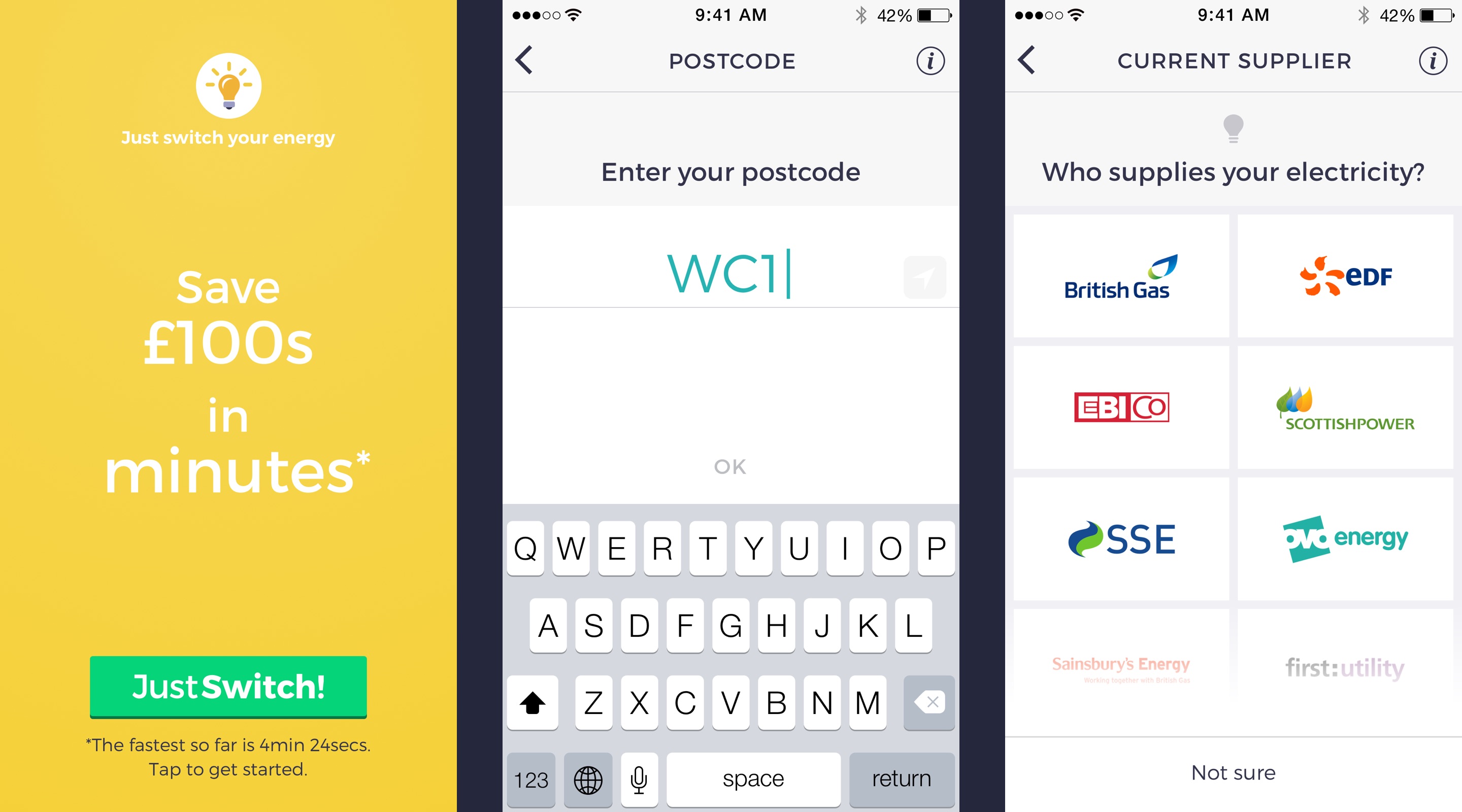
Inspired by the ‘wizard’ form design pattern, each major step or input from the user was split into individual screens in order to heighten focus and create a faster sense of progression. A single instruction or question was presented at the top of each screen followed by an input method designed to best suit the type of information we needed to collect. For example, we used quickly recognisable energy company logos rather than a list of names to make selection easier and faster for the user.
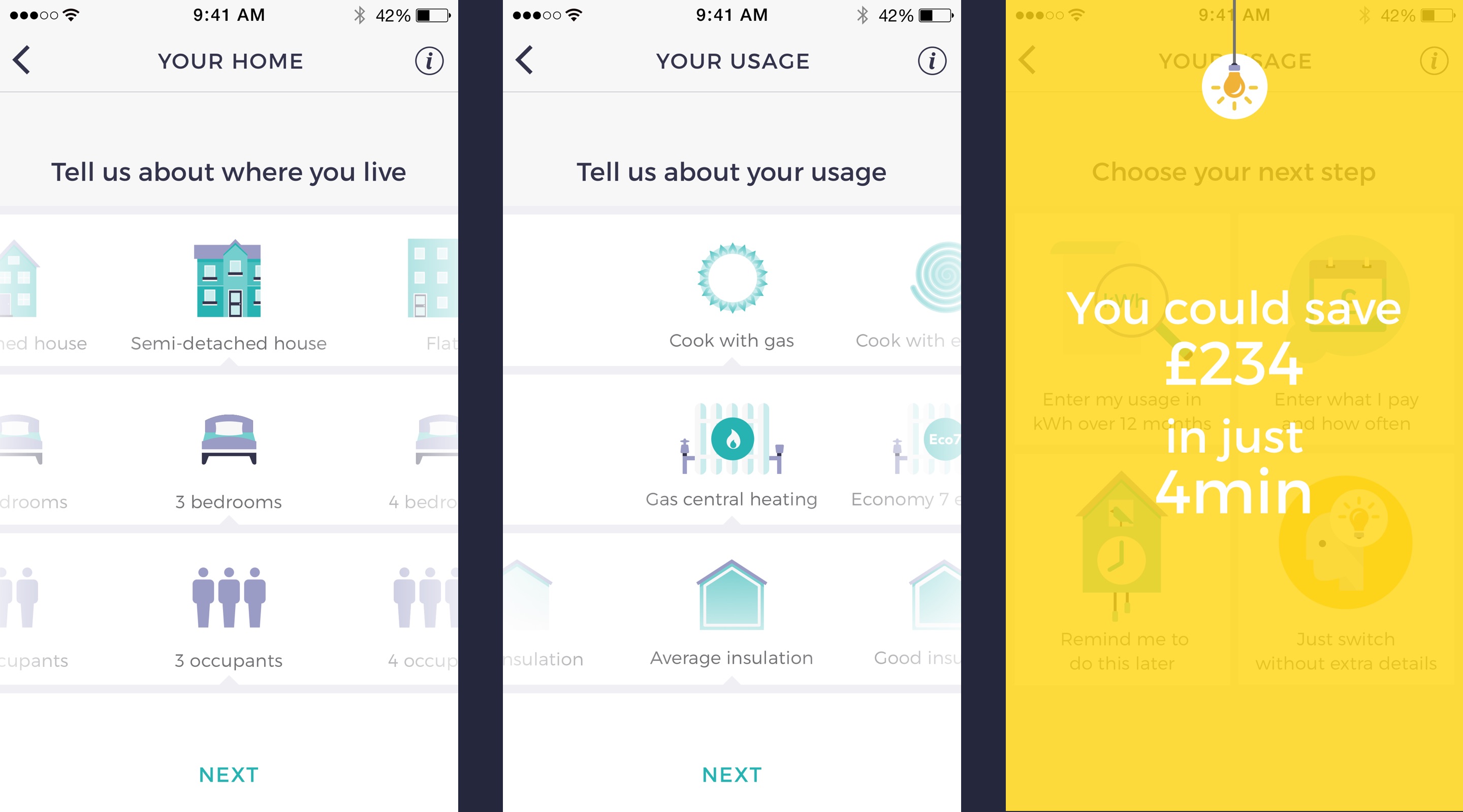
To make selection fast for the user when telling us about their home, we designed simple sliders with illustrative icons. This allowed the user to select their options with minimal effort by swiping left or right. The most common options were also pre-selected to reduce friction for the most prevalent type of user.
A quick estimate was displayed after providing this information. We displayed it as an animated overlay on top of the next screen that would disappear when tapped. This was to partly act as a moment of delight for the user, rewarding them for getting this far, but also to encourage progression to the next part of the app.
Refining the estimate
After the estimate, regulation dictated that the user had to be the one to select which direction they wished to progress next, with the options being:
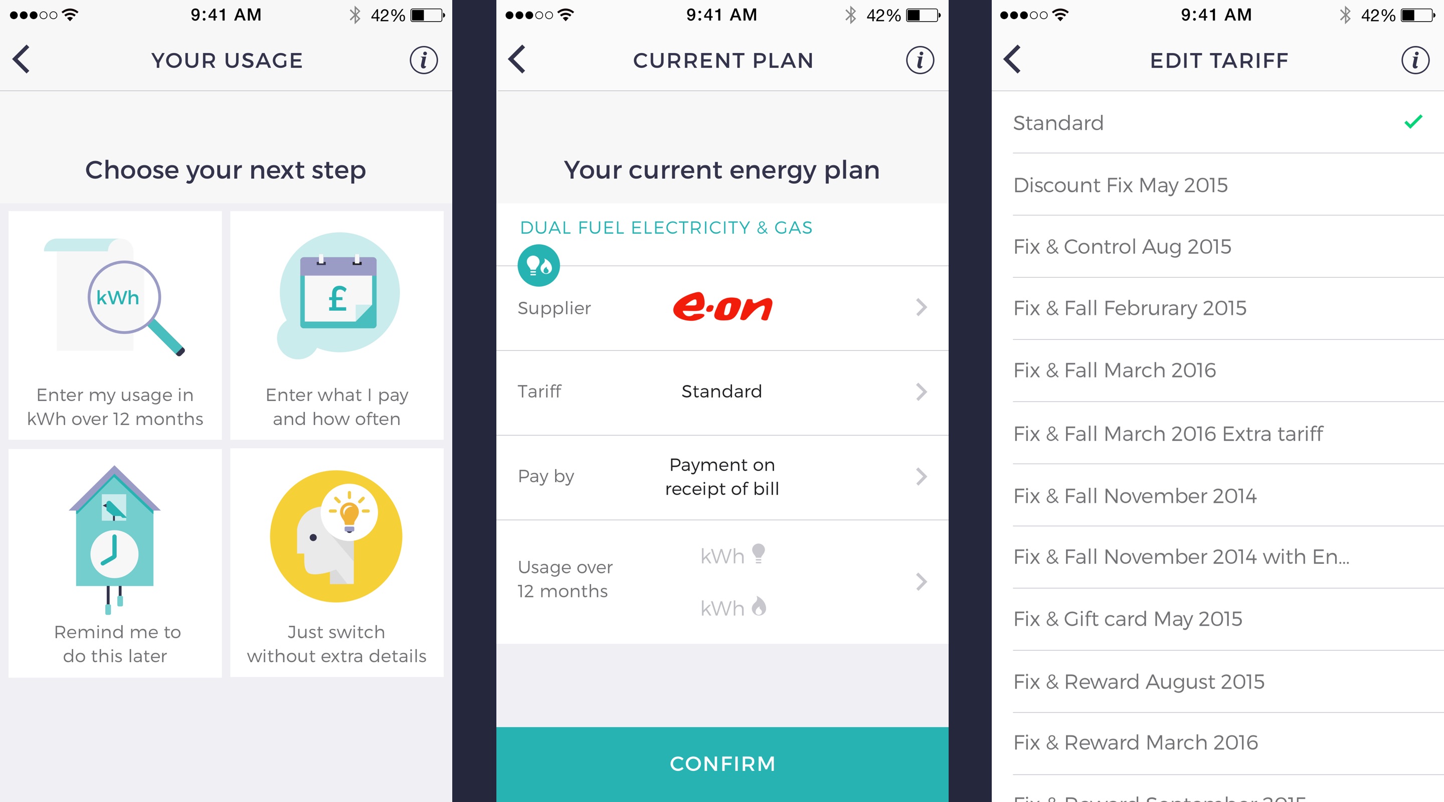
- Provide more information on their energy usage in KWh
- Enter how much they pay each month
- Come back later (for which we would set a reminder)
- Proceed with an estimation based on information they had already provided
We believed that there were benefits to progressing with a quick estimate and less information, as the faster the user got the point of selecting a new energy provider and seeing more benefits to switching, the more likely they would be to actually switch.
We made use of a simple colour palette to design many illustrative icons to help indicate the ‘happy’ path we thought would be best to take through the journey and guide users through the app in a more engaging way.
Switching
The final part of the journey is switching energy supplier. This is where the user, whether they entered more detailed information about their energy usage or not, is presented with a new estimate and a list of alternative energy suppliers that will save them money.
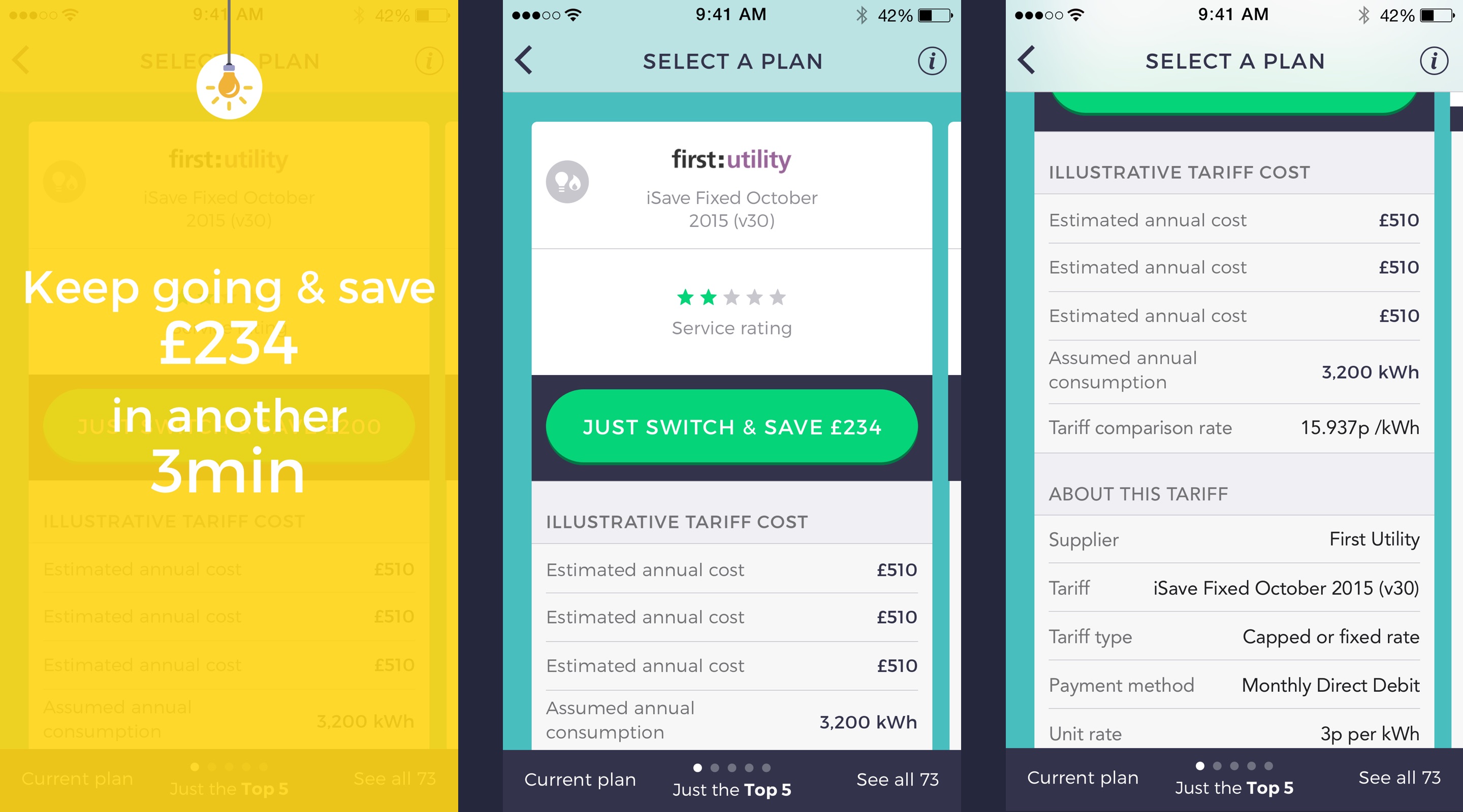
The energy suppliers were sorted to show the ones that achieved the most savings first. However, we learnt through testing that there were other important drivers for a user to select a new energy provider.
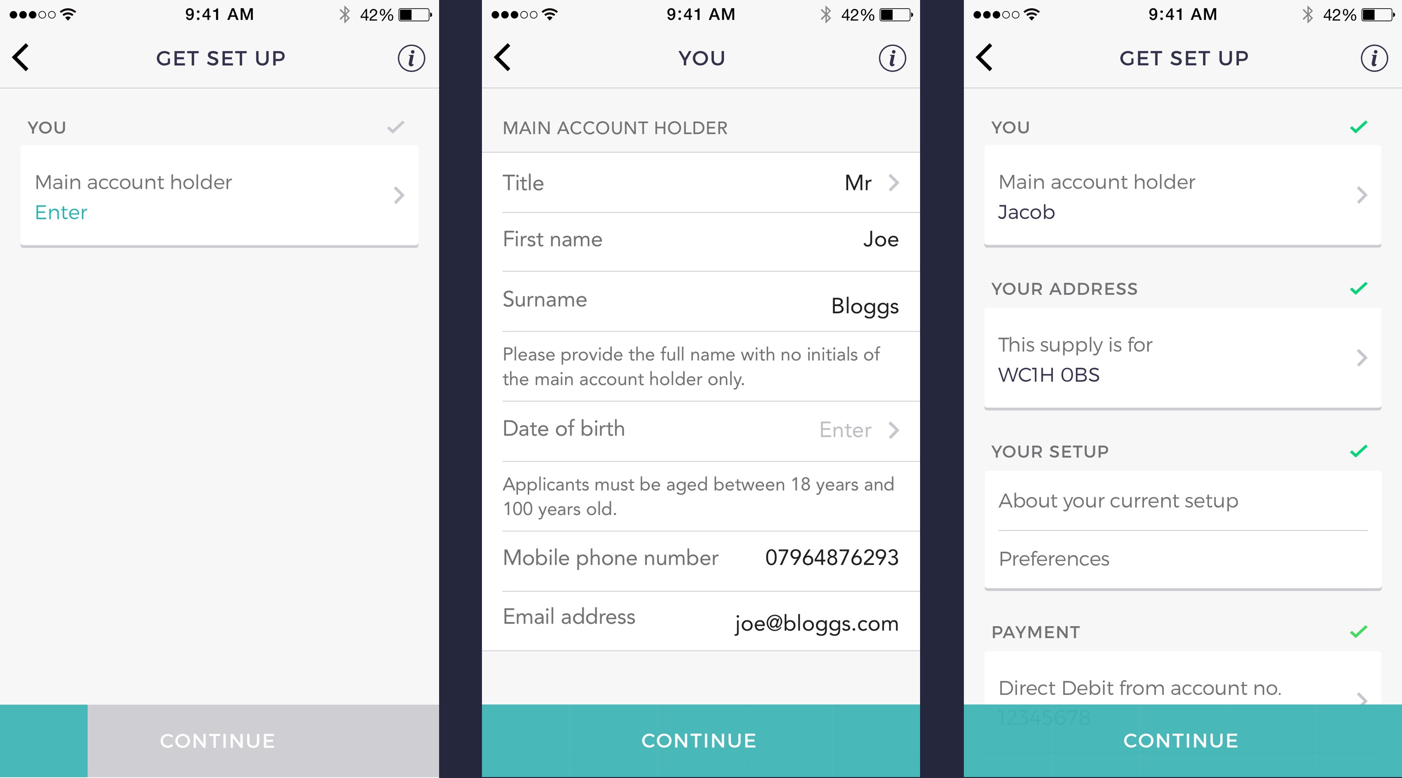
Due to density of information required from the user to switch suppliers, we designed what we called form ‘packets’ - we organised all required inputs into taxonomies to break the form into more manageable parts. Each ‘packet’ is then shown to the user one at a time. The ‘packets’ can then be ‘entered’ to reveal the related inputs. When complete the user returns to the previous screen. We also show a progress bar to inform the user of their progression through the overall form.
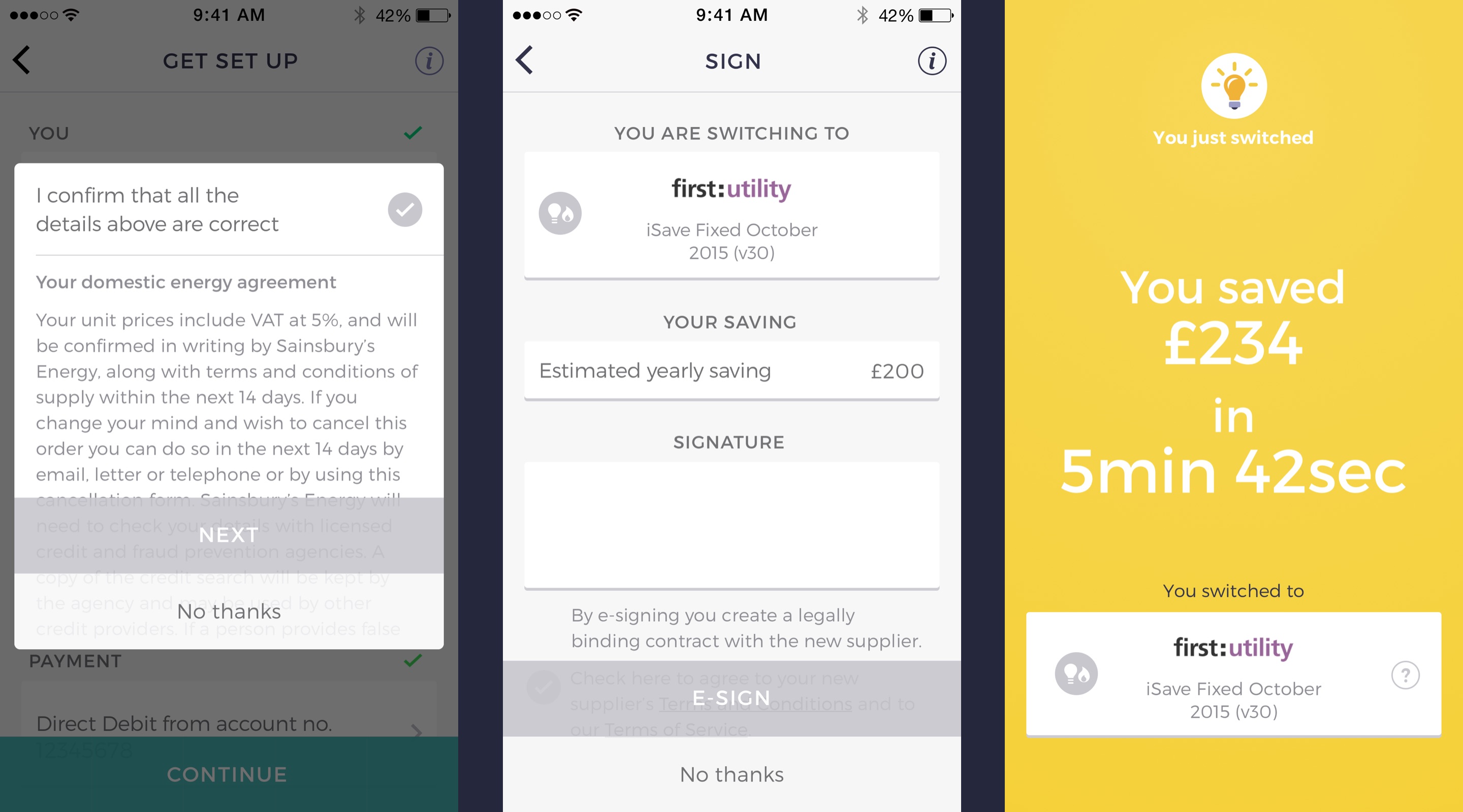
The final part of the journey is to confirm the switch. The user must agree to the terms and conditions of switching to the new supplier and provide an e-signature. The final screen reminds the user of how much money they could be saving and who they switched to. The screen also shows status updates when the app is returned to.
Landing page and marketing
A simple landing page was built to help market the app and it was advertised on facebook and twitter.