About
Tandem is a ‘challenger’ bank that combines traditional banking products such as credit cards and savings accounts with a modern banking app experience that helps customers save money and manage their spending. As a brand-new bank, every part of the customer experience had to be designed from scratch.
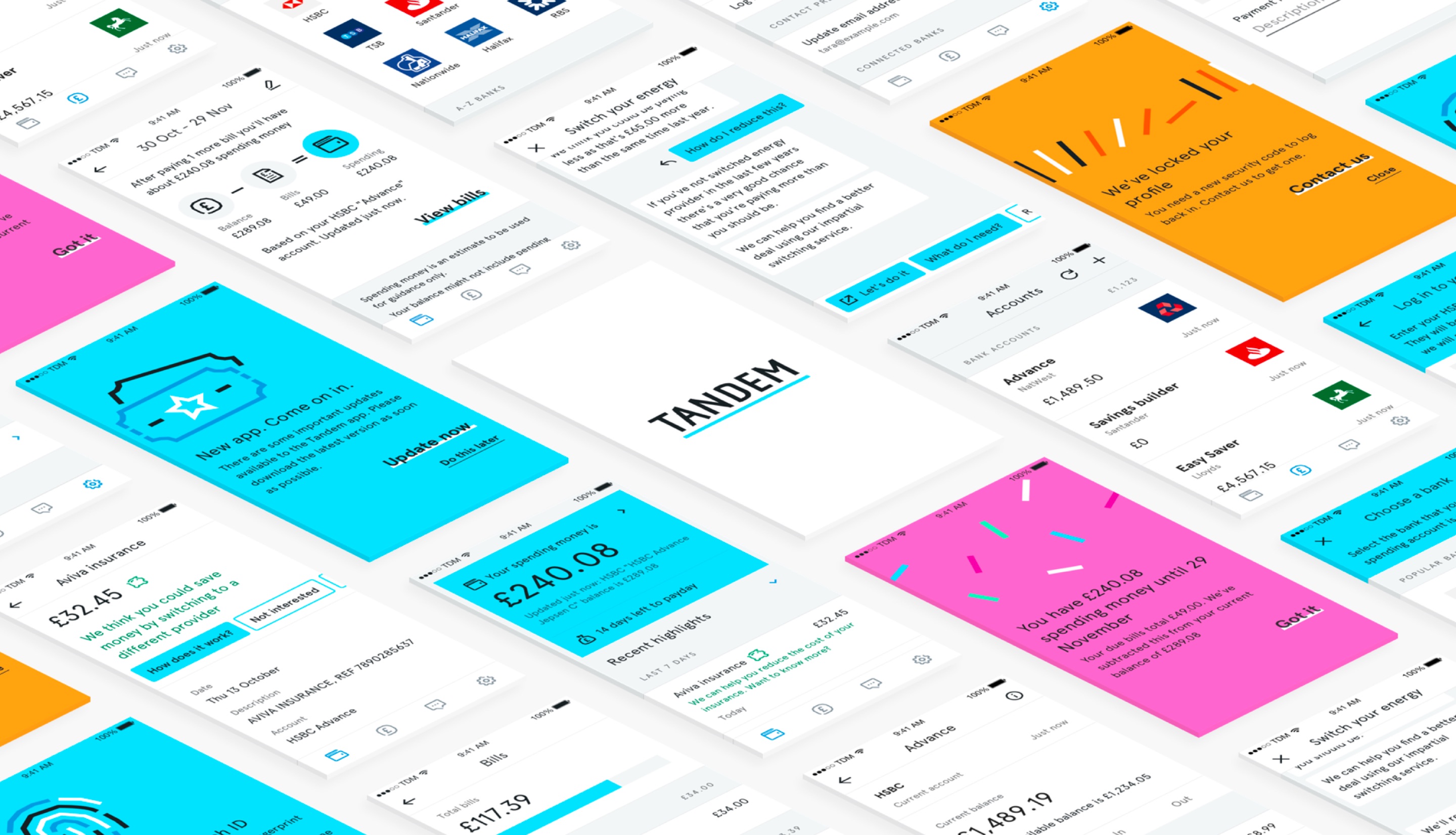
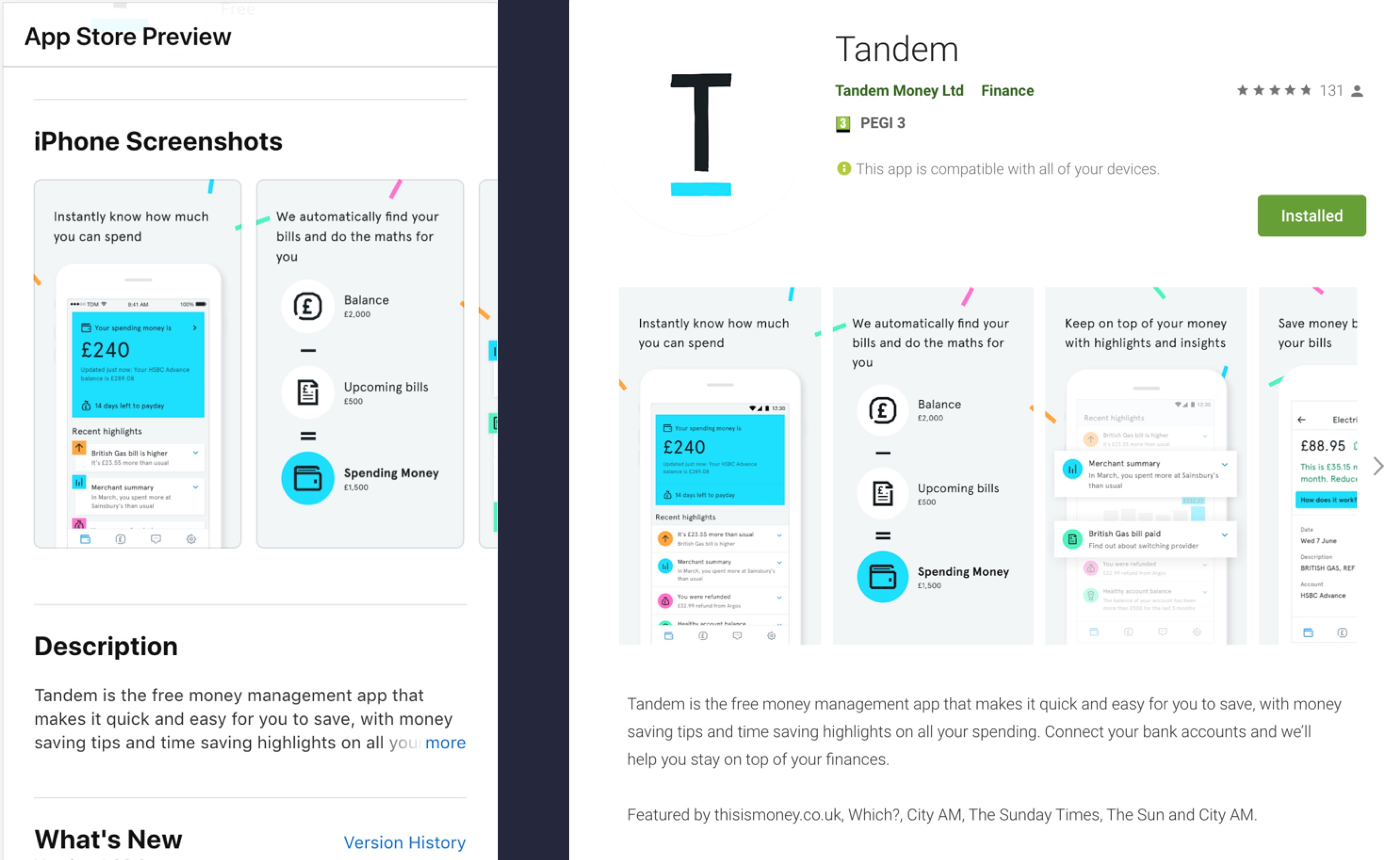
The app for launch gave users the opportunity to connect their existing bank accounts to the app (aggregation) as well as use their new Tandem banking products - this gave users a more holistic view of their finances and Tandem new ways to help customers save money.
Target users
Tandem was initially aimed at a millennial audience. In-depth research and consumer segmentation narrowed this down to a ‘Live for the moment’ segment becoming Tandem’s intital target customer. As such, the app and product experiences were designed for this segment.
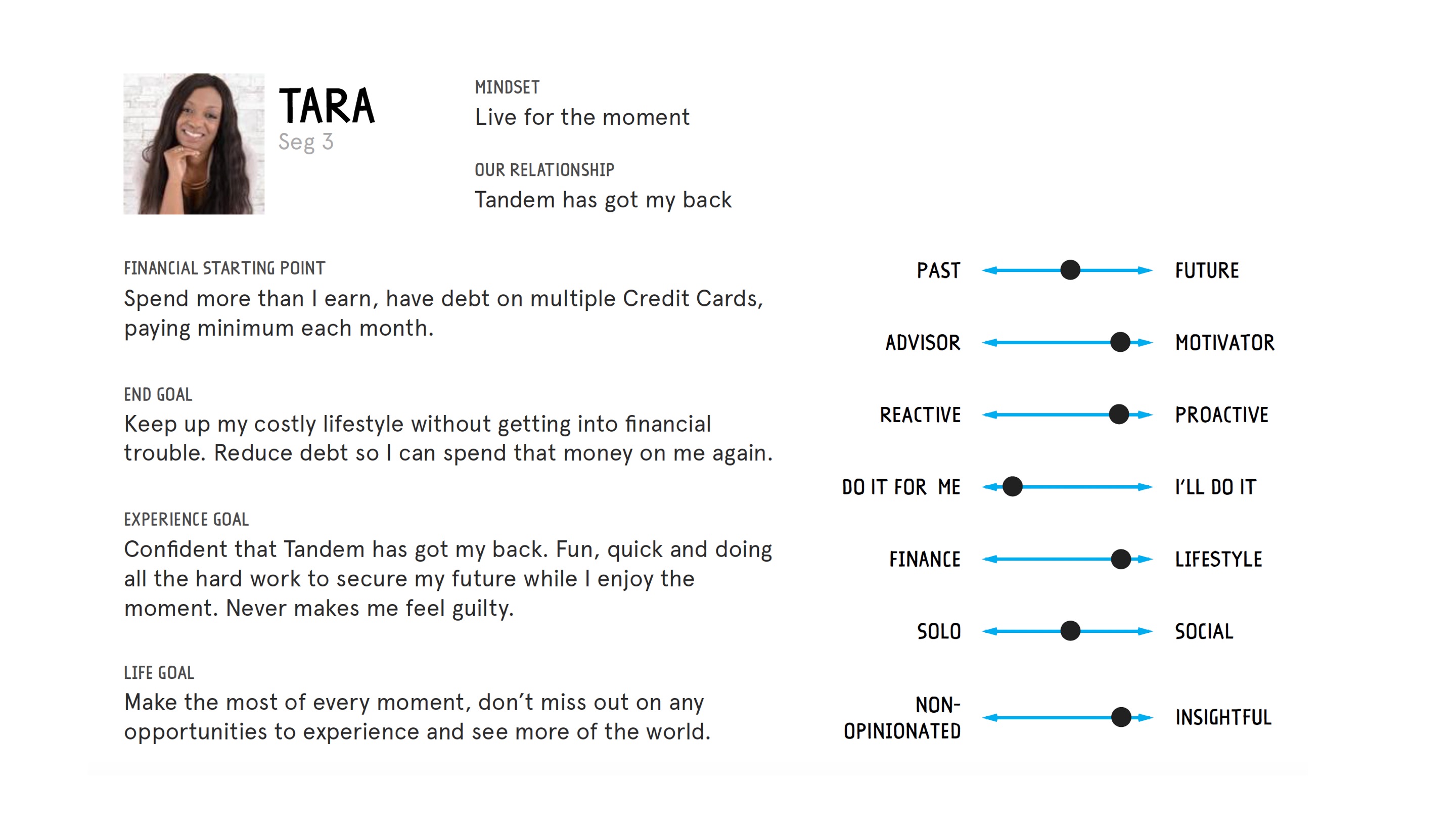
The ‘live for the moment’ segment are characterised by some common traits:
- Slightly younger, perhaps with a wealthier background, living for today
- Borrowing unwisely to fund lifestyle, often hit with ‘unfair’ charges, could use help planning
- Looking for something simpler, more engaging, more fun
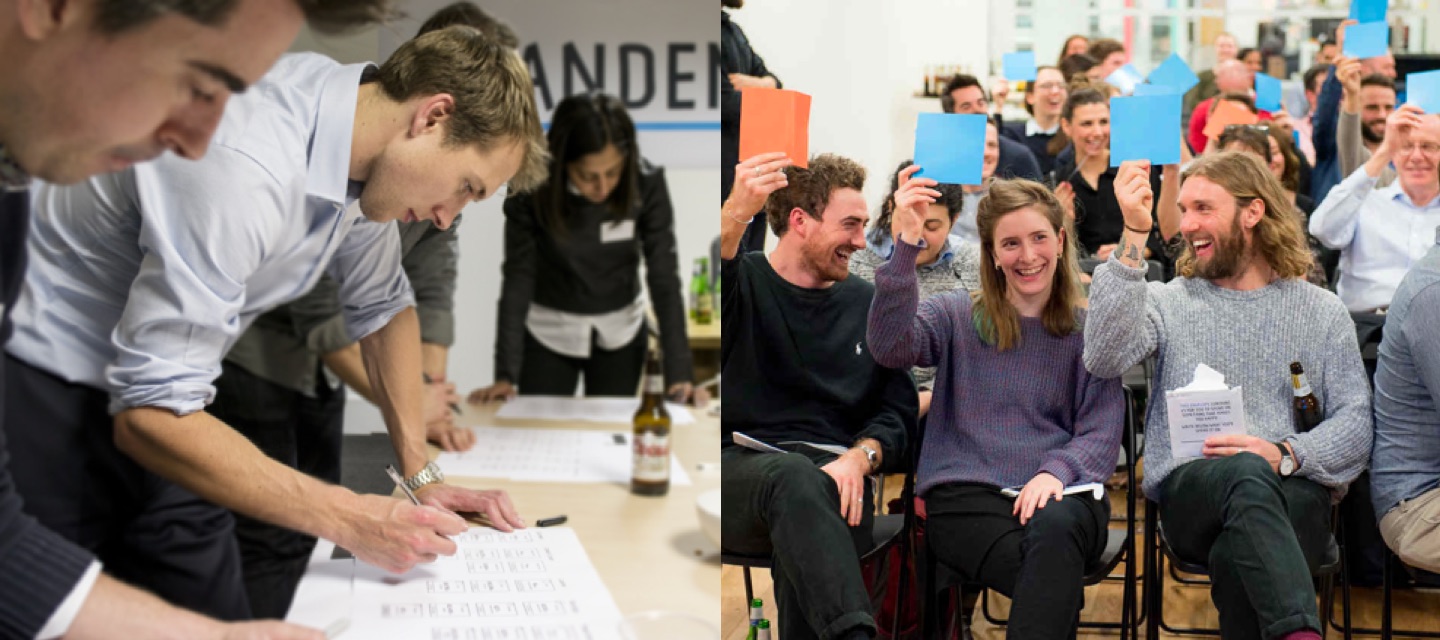
The app and products for launch were co-designed with members of this segment, sourced from Tandem’s 20,000+ strong community of ‘Co-Founders’. They became the banks early adopters and are still involved in helping shape propositions, products and features.
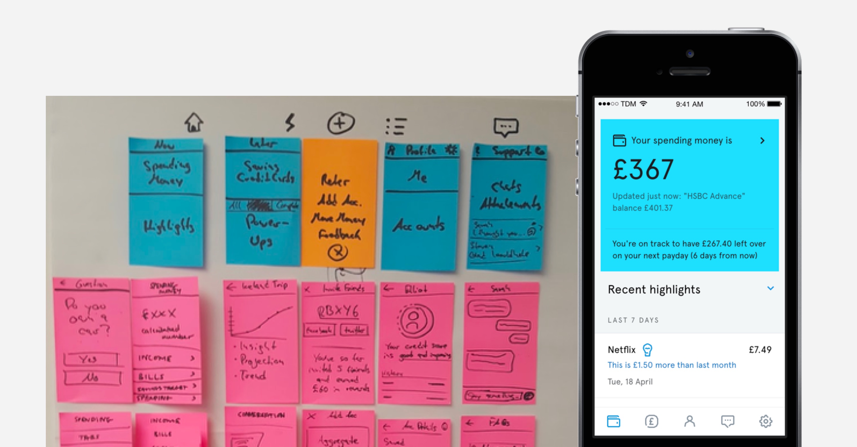
Journeys & Interaction
Hundreds of user journeys and interaction patterns had to be designed and tested in order to piece the app together. Some of the most complex areas of the app to design were the application forms for savings accounts and credit cards. The forms were designed to be cross-platform for iOS, Android and responsive web.
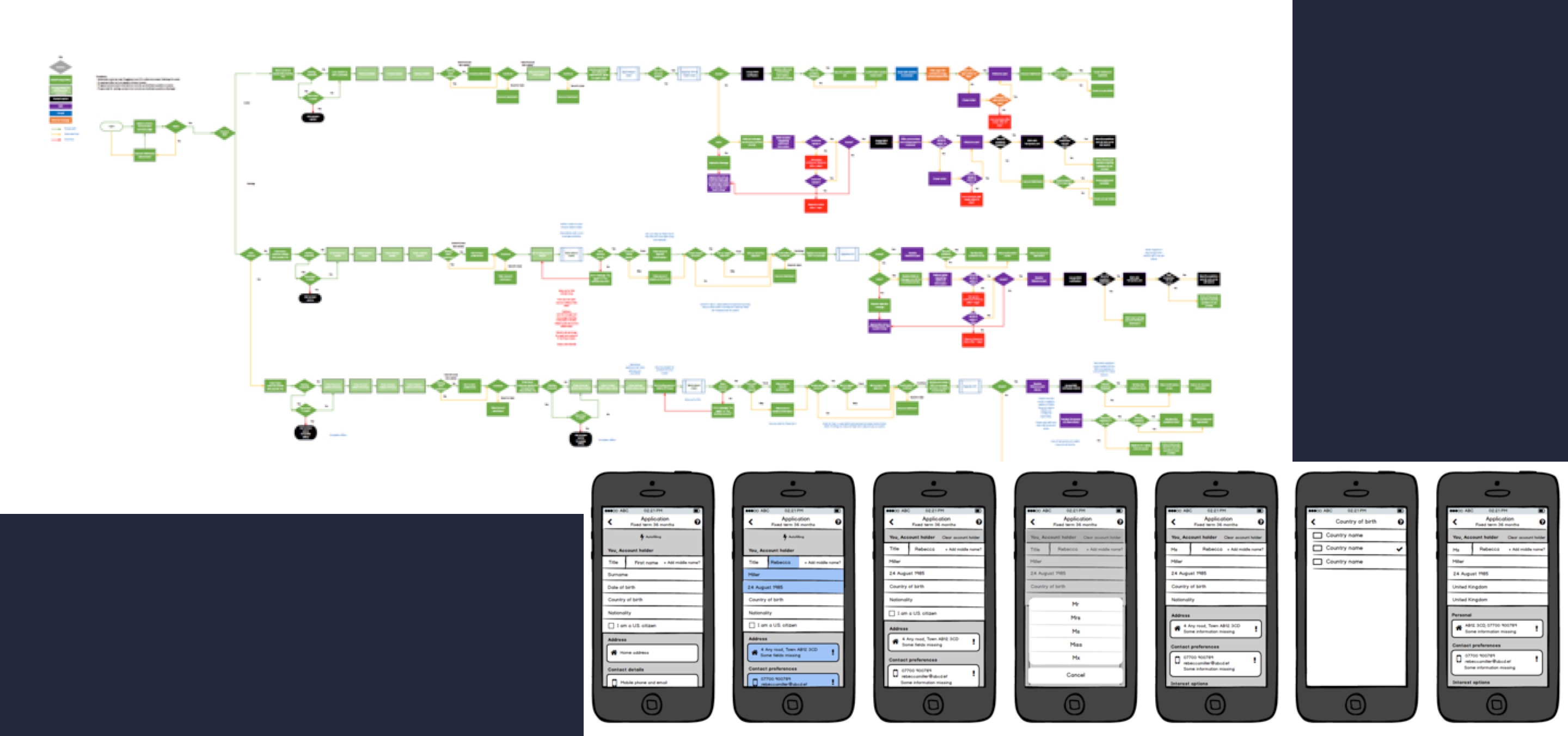
I was one of three designers that tackled these journeys for both Tandem’s savings products and credit card products. We started with the operational process flows that had already been put together and ran workshops with subject matter experts to map out ‘dream’ scenarios for each journey. Once we had our ‘dream’ journeys we overlayed any technical and regulatory constraints and started to put together wireframes.
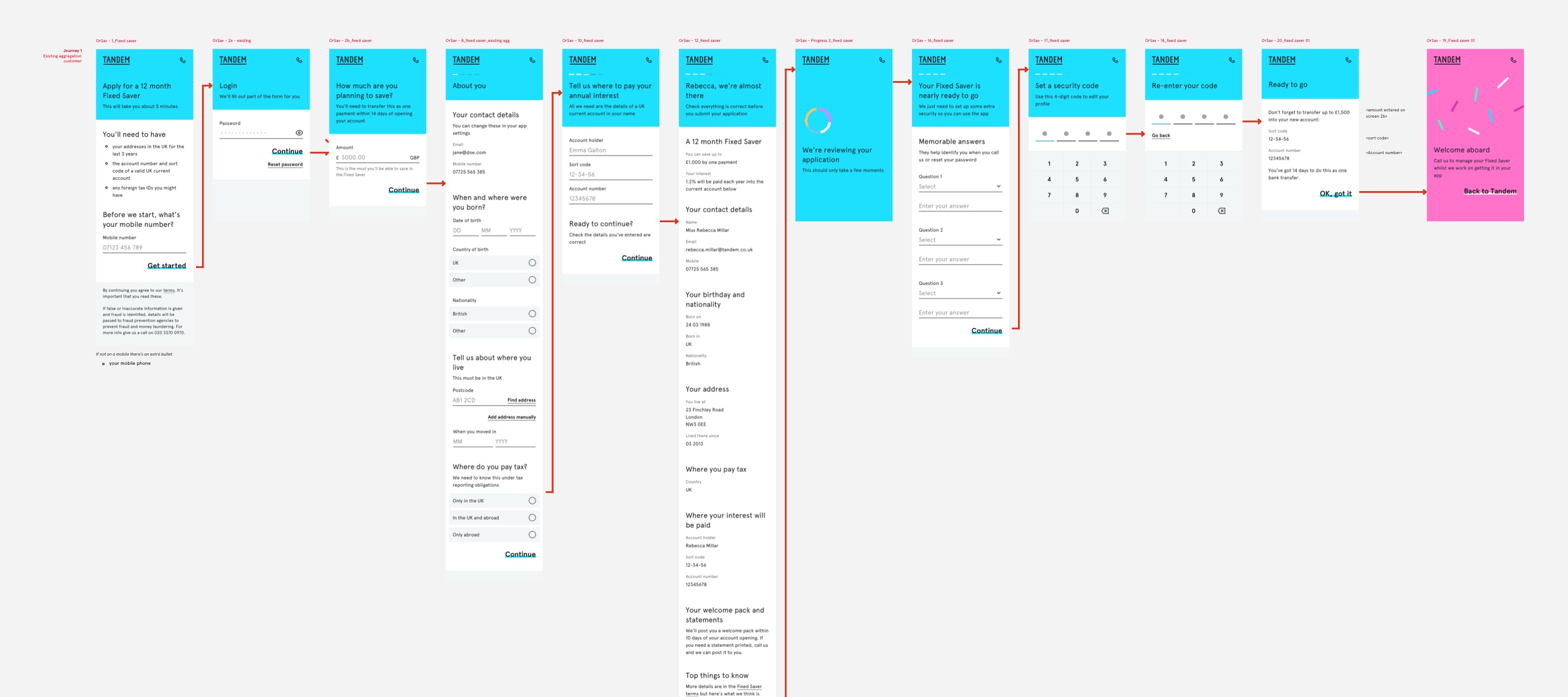
Lots of personal information needed to be collected from the user during the application and the order that we collected this information was important. I worked closely with engineers to understand back-end processes and shape how this information should be collected from users in both the UI and the client.
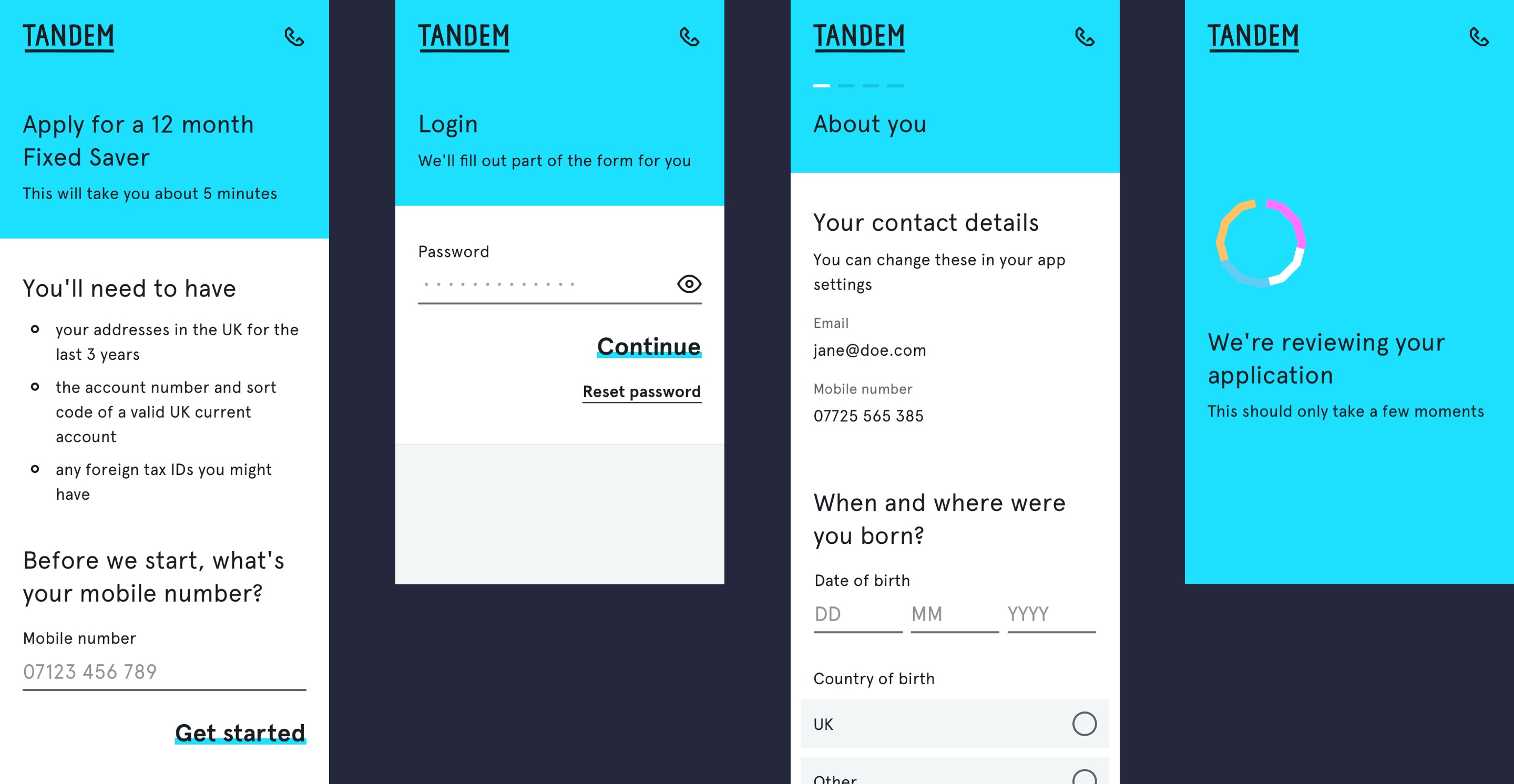
Every part of the form design from structure to copywriting was considered, prototyped and iterated on heavily. Form features such as setting expectations up-front, progress indication, autofilling information, clarity of copy and validation were all added to give the user the best experience.
To further stand out from traditional banks we added ‘moments of delight’ throughout the applications - these were moments that brought to life Tandem’s personality and delivered a more uniquely Tandem experience. One feature of the Tandem credit card was that you could choose from 4 colours so this was one such moment we invested in making particularly ‘delightful’ for the user when applying.
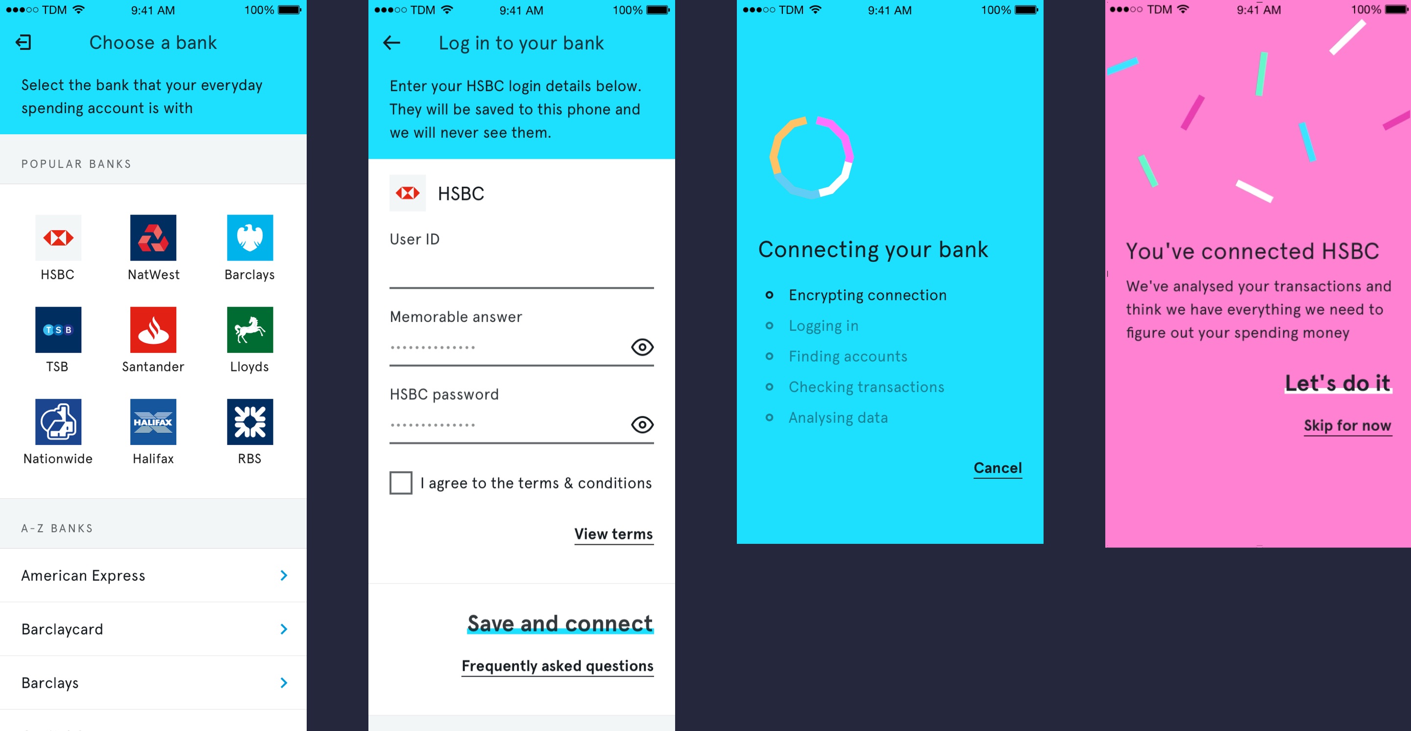
Other journeys I worked on included aggregation (connecting other bank accounts), login & registration, core banking and payments. Much of the fundamentals of Tandem’s design language and principles were born out of the early work of designing these forms and they were continually iterated as the design language matured.
Onboarding & App intro
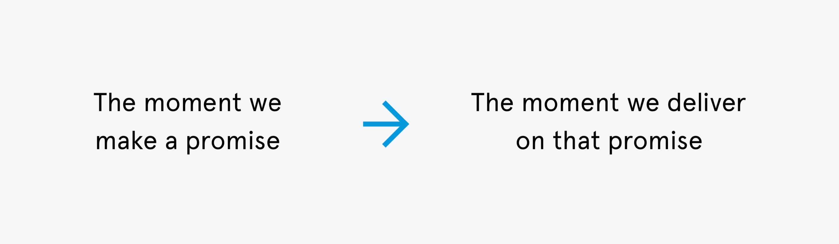
I was part of the team responsible for onboarding. We characterised onboarding as everything from the moment Tandem first made a promise to the moment Tandem delivered on that promise.
For example, for the first release of the app our website made the promise to show you how much money you can spend each month. We would have then delivered on that promise when you had successfully set up the ‘spending money’ feature in the app which showed you how much money you had left to spend for the rest of the month.
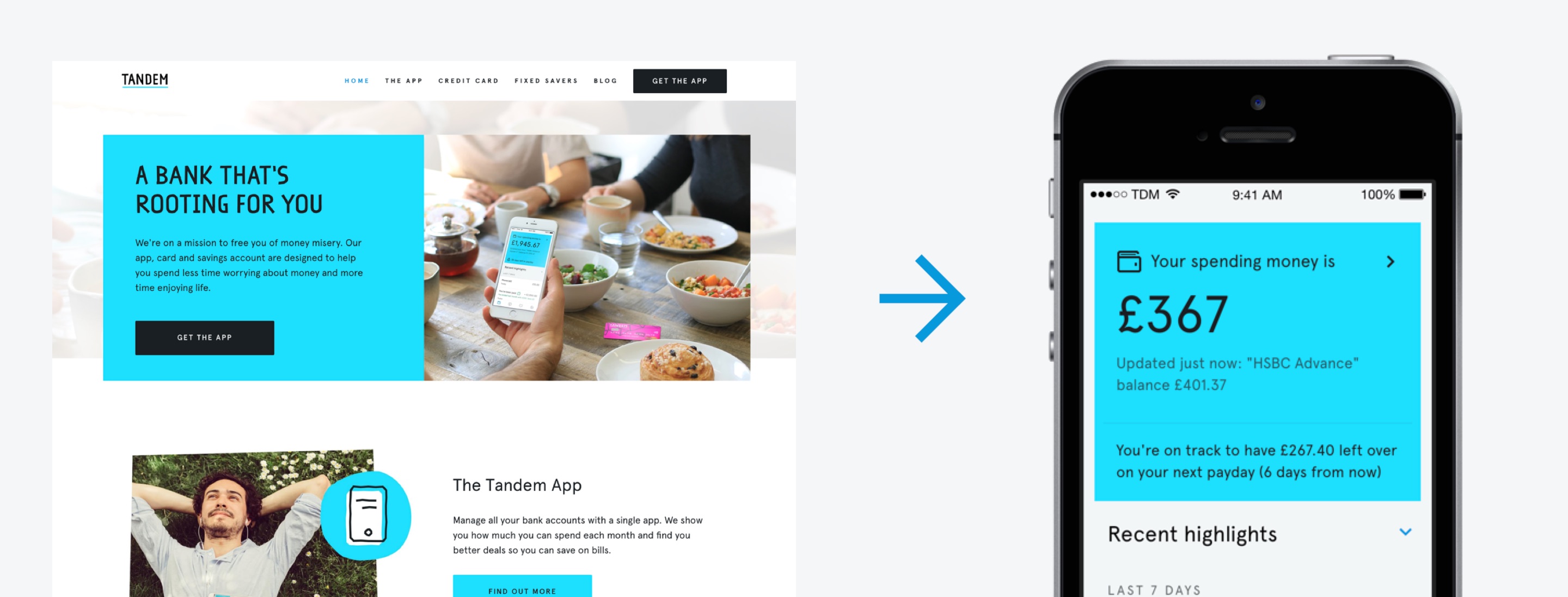
The ‘spending money’ feature required new users to sign up to use the Tandem app and also connect an existing bank account by providing their bank account details. We understood from mapping our onboarding journeys that this would be the biggest point of friction for a new user so it was imperitive users understood the potential value of connecting their bank accounts to avoid drop-outs and help us fulfil our promise and we decided the ‘app intro’ would be an effective way to do this.
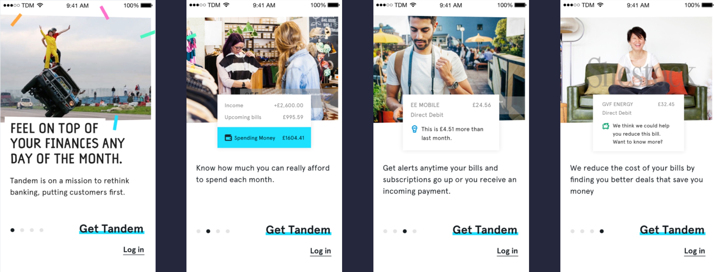
We facilitated fortnightly testing sessions with segmented target users to refine our onboarding journey and specifically the app intro. We threw away multiple concepts and prototypes for our app intro such as an interactive carousel that guided the user through the main features slide by slide.
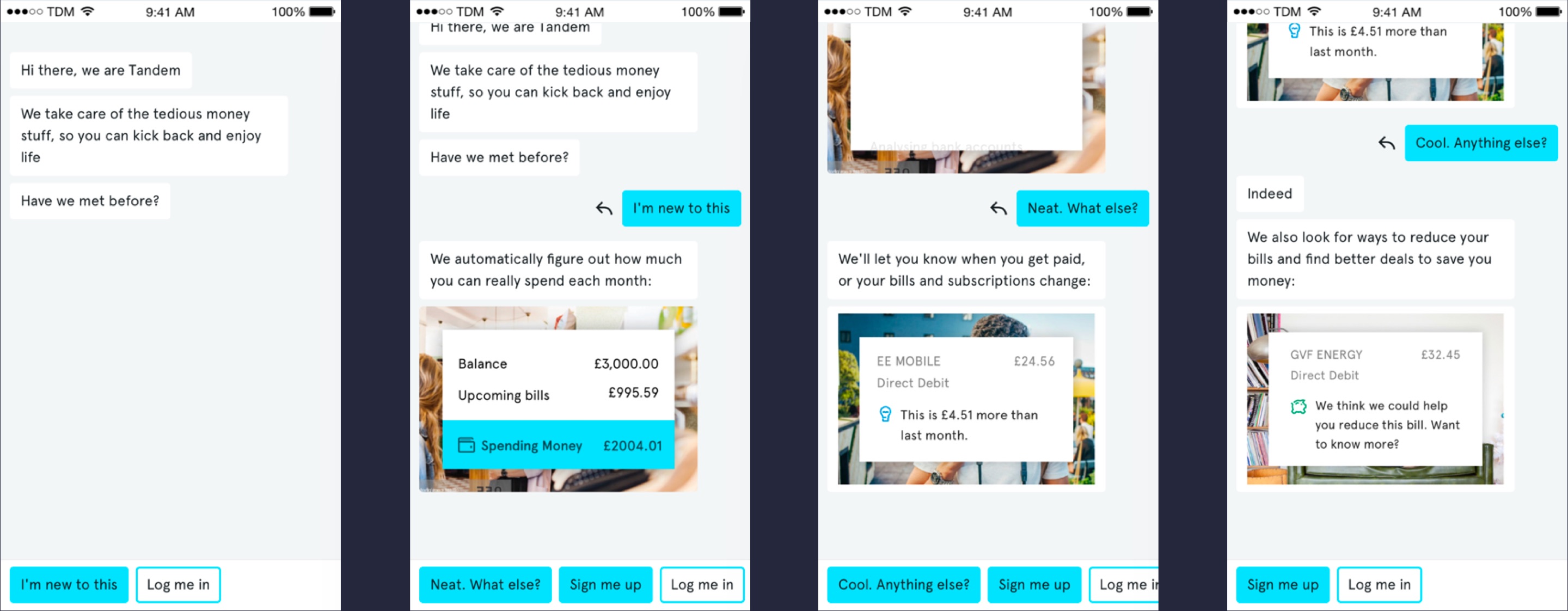
Our testing showed that our target users were more inclined to read larger amounts of text and we could hold their attention longer when content was presented to them in a conversational, chat style interface. We eventually settled on a conversational chat interface that felt effortless for the more relaxed user but offered more support for those who were less convinced or concerned about security.
Website & Reach
Whilst I was at Tandem I was involved in designing multiple versions of the website. The most important iteration of the website was the website used for the first release and launch of the app. The website needed to clearly explain Tandem’s proposition and convince users to download the app. It also needed to show that Tandem was different to the other, more traditional banks.
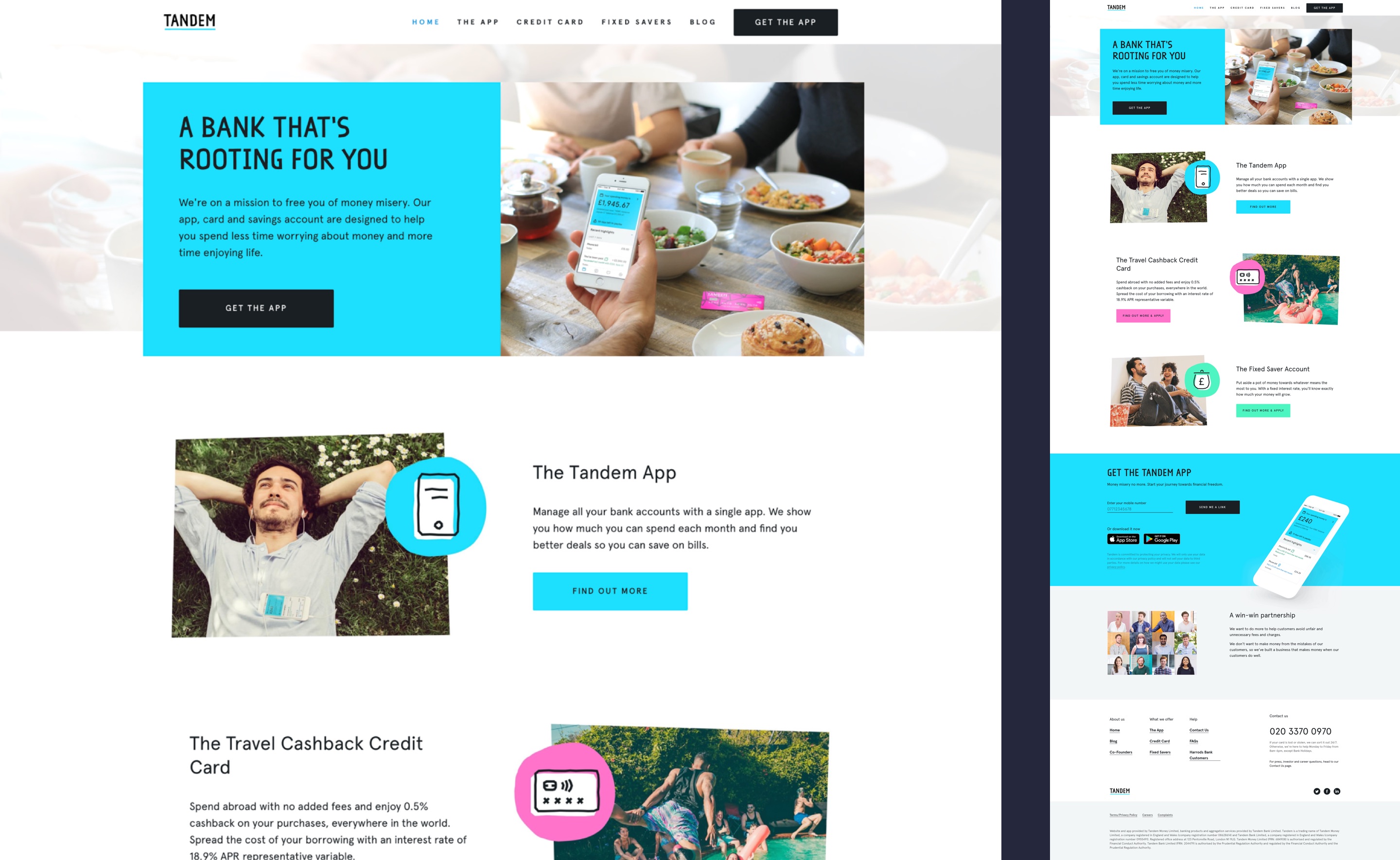
The website evolved over time and it was important to express the brand coherently across all marketing channels such as ads, app stores and the website as well as within the app. We tested all areas of the website and the app with multiple methods to ensure we knew how it was percieved.
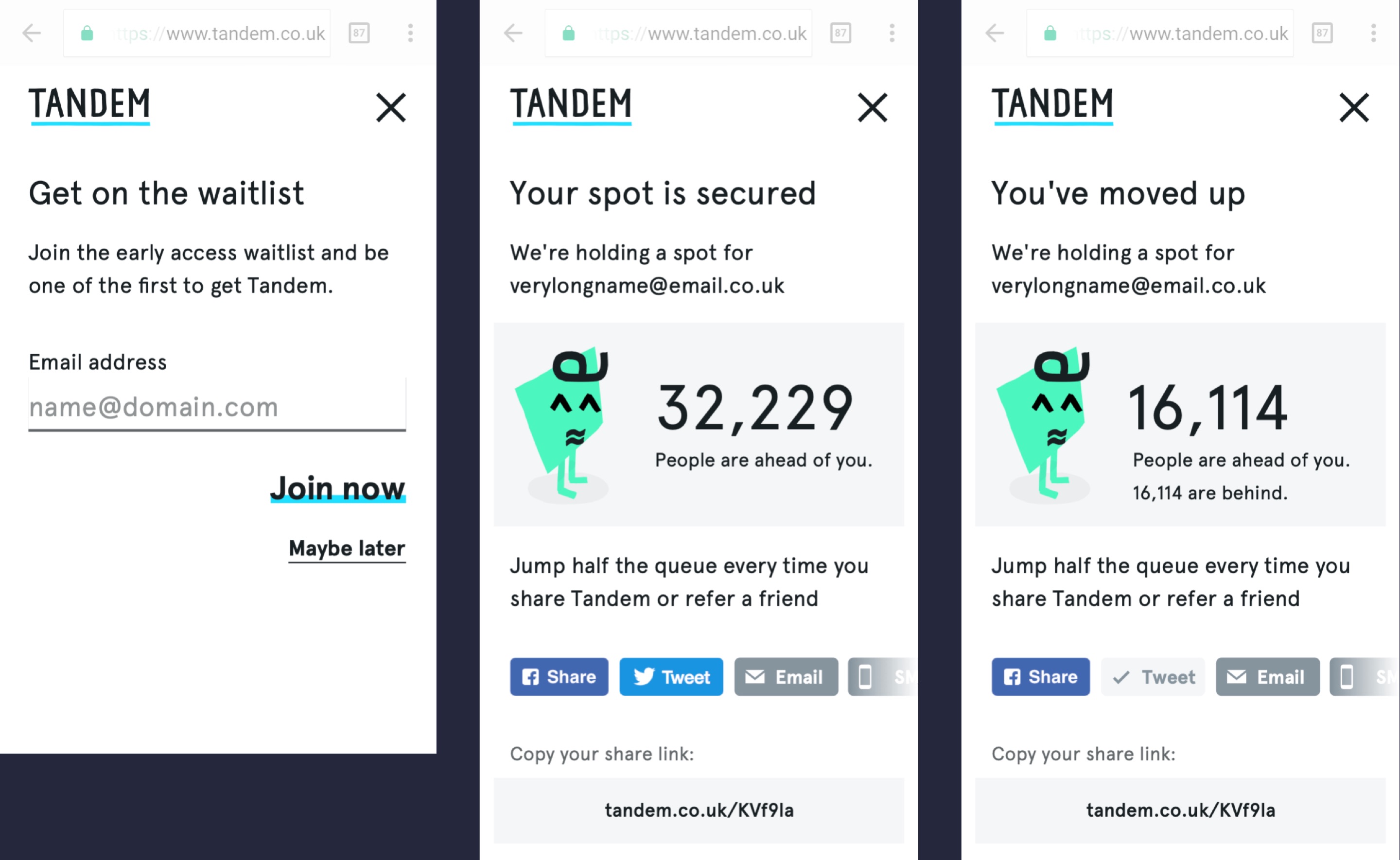
I also designed a waitlist feature to create some buzz around the first release of the app and set expectations about timings and access. It was also useful in helping measure and control the usage of the first users.
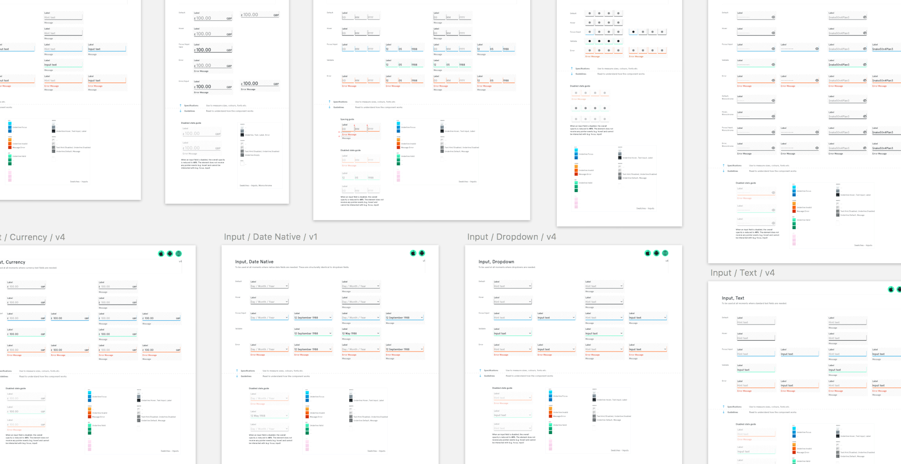
Design System
We wanted to design beautiful interfaces that could be quickly iterated whilst at the same time being at least be AA accessible. Our answer was to make use of Atomic Design principles and ‘components’ as part of our design system.
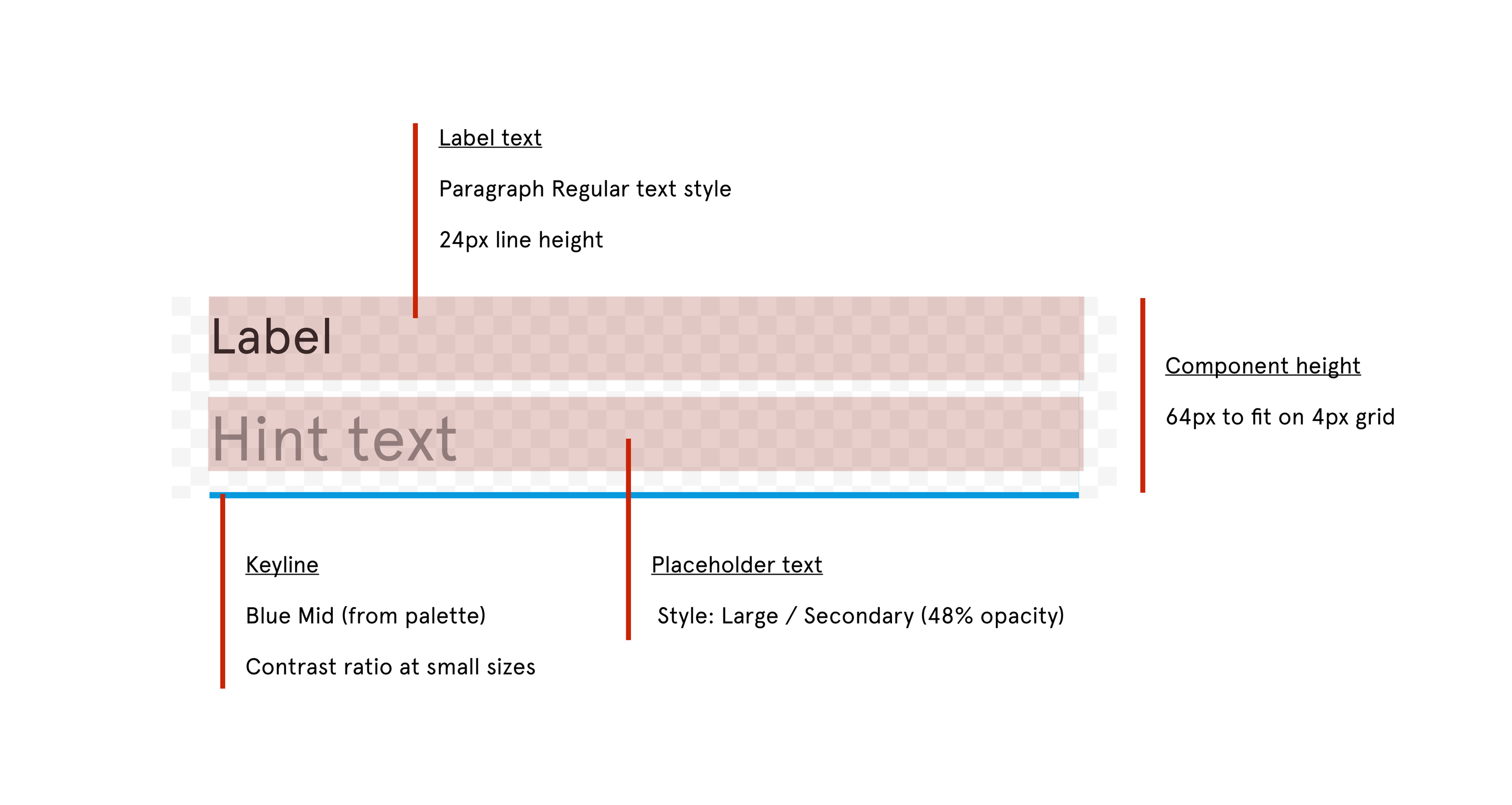
Components were designed to be shared and re-used across multiple journeys and product areas. Each component is made up of smaller parts (atoms) and styles - all of which adhere the design system’s guidelines (grid, spacing, typography, colour etc.)
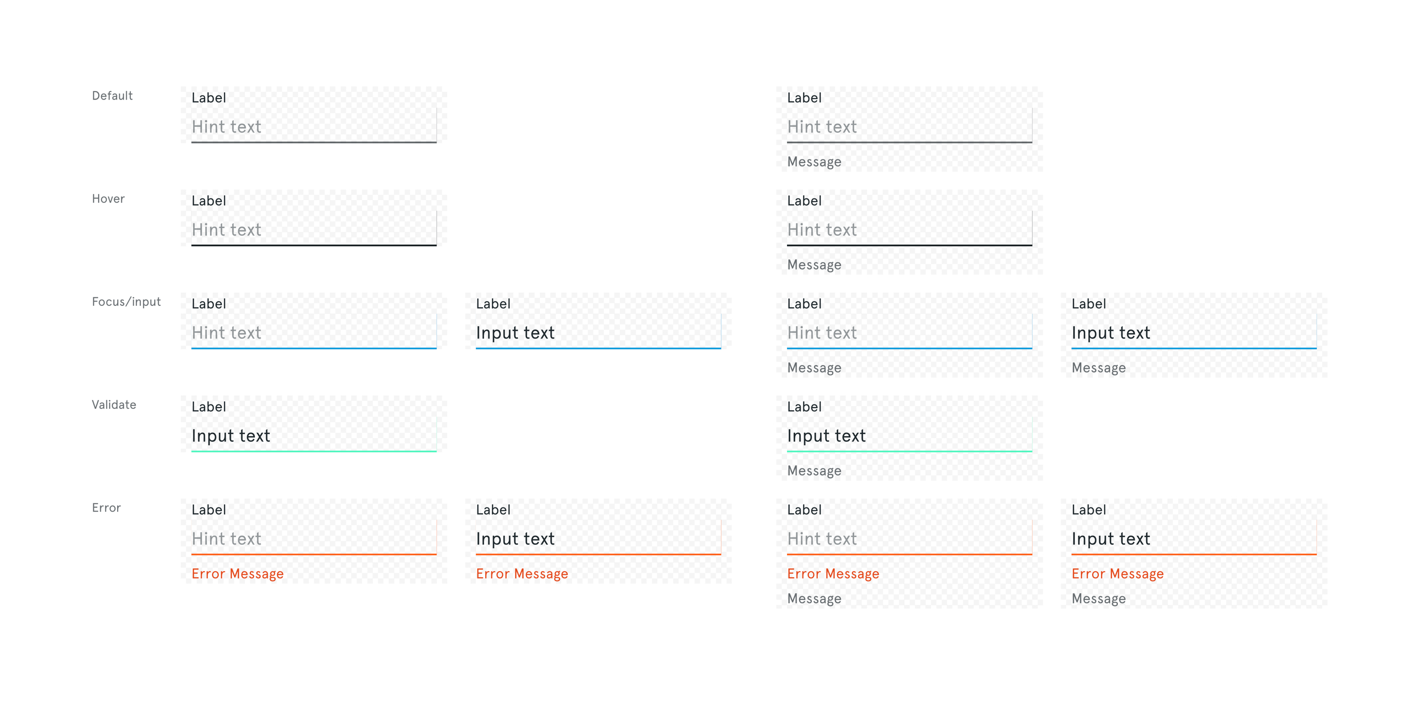
I was part of the team that created the design system from scratch. I was responsible for establishing the process with product and engineering and defining the overarching guidelines that effect the design system holistically, as well as contributing to many of the 300+ individual components.
Prototyping
Prototyping was an important part of our design process at Tandem. I created many prototypes from small animations to full interactive journeys. I also helped prototype guidelines and components of the design system using HTML, CSS and JS.
These prototypes allowed the team to test our rules and guidelines as well as rapidly build interfaces such as forms that we could put in the hands of real users. They also helped when working with engineers as we could already speak a common language when it came to any rules of implementation.
Possibly the largest prototype I worked on was an investor demo app. Working together with Christoph (another designer on the team) we designed and built a realistic app prototype used for investor demos. We rapidly sketched, iterated and built the prototype in 2 weeks. It helped Tandem attract tens of millions of £s by sharing a realistic view of the ambitions and future of the Tandem product offering. It also gave us a platform for testing new app features.